Amtrak Design system
A revamped design system created in Figma for Amtrak
Duration
9 months ongoing
Year: 2024
Team
Isabel, Harrison, Raksa
Tiffany
Tools
Sketch, Figma, Typescale, Storybook
Role
Researcher & Designer
Overview
I collaborated with Harrison, Raksa, and Parnaz to build a simple and scalable design system and digital style guide for Amtrak. Although Amtrak had a digital style guide created by a contractor a few years ago, it was outdated. Additionally, the existing component library in Sketch was limited and poorly organized.
Booking flow UX Audit
Tiffany and I completed a component audit for Amtrak’s booking flow across iOS, Desktop, and Kiosk breakpoints. We identified numerous inconsistencies, such as varying icon sizes, the use of three different fonts across pages, and improperly implemented buttons.
Too many variants
From the component audit, we grouped together all instances of each component, revealing an excess of variations. This highlighted the need to establish a single source of truth for our components, which will be integrated into our upcoming design system.
creating the component library
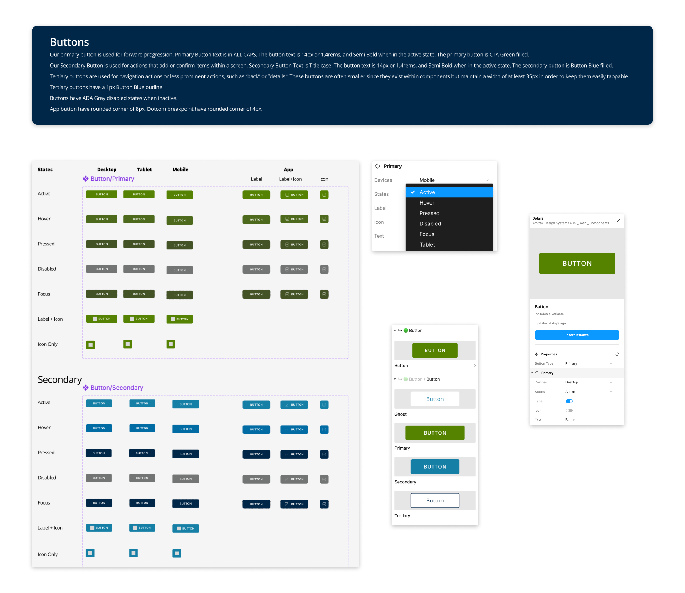
We began by identifying all necessary components and icons used across the app. We created a centralized component library file in Figma that includes a wide range of components, from buttons and form fillers to icons and navigation elements. We made sure to implement:
Standardized Naming Convention: We established a standardized naming convention for components and icons to ensure consistency and ease of use. Each component is labeled clearly and intuitively, making it easy for designers to find and insert the correct instance.
Clear Documentation: We provided clear documentation within the design system file, including descriptions and usage guidelines for each component and icon. This helps designers understand how to use each element correctly and consistently.
Variants: We made sure to create variants of components to help organize and group similar components into a single container, thus simplifying the component library.
COLOURs
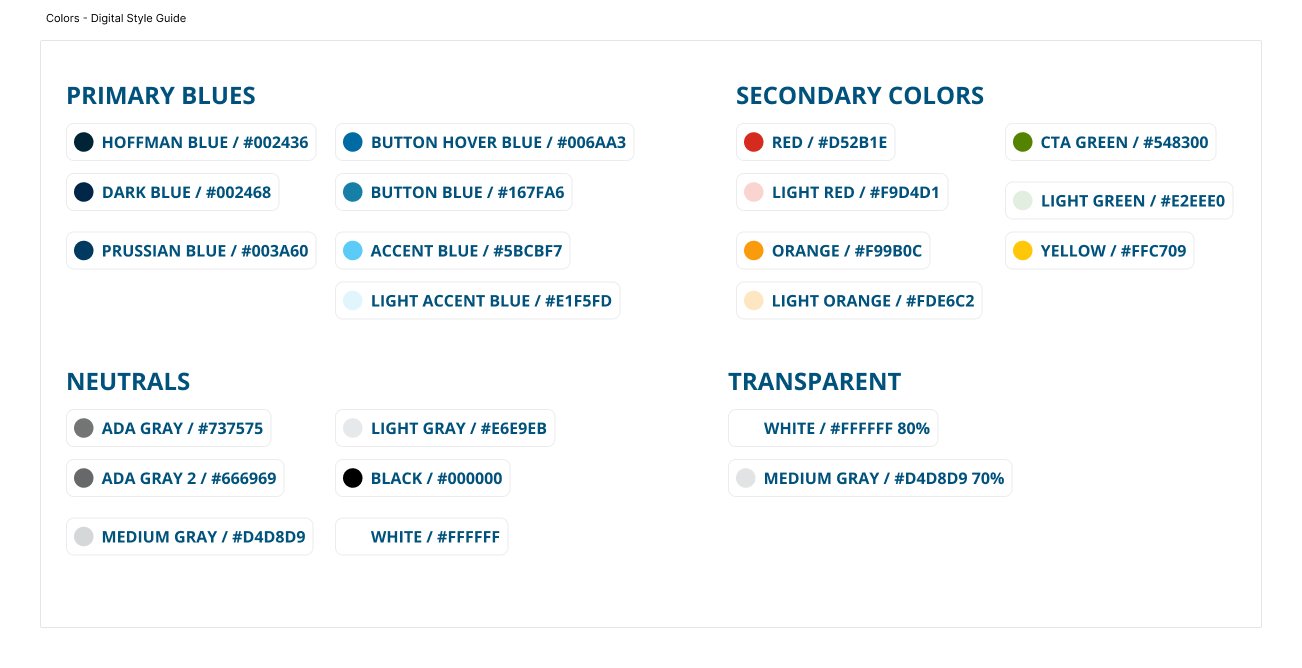
Next, we examined the colors in Amtrak's digital style guide and noticed the lack of a meaningful naming convention. To improve usability, we decided to assign semantic tokens to the colors. Instead of arbitrary names like "Prussian Blue" or "CTA Green," we categorized colors by their function, such as "Text" and "Success." This change makes it easier for designers to choose the correct color for specific actions. For instance, they can now use "Hover Green" for a button in a hover state, enhancing clarity and consistency in design.
Typography
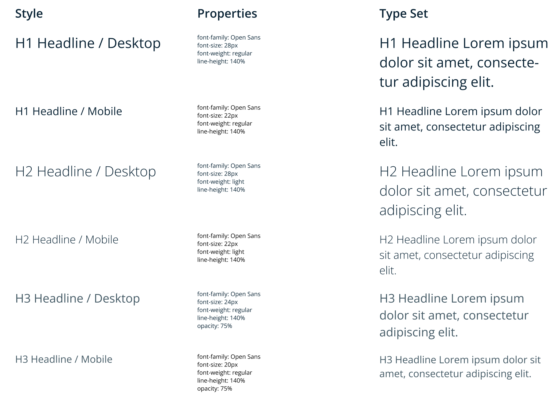
We wanted to make sure typography is now very standarised throughout our breakpoints as we had learned there were multiple fonts being used on a page (from Calibri to Helvetica to Arial). We quickly mapped out the styles of Headline, Subtitle, Body, and Button propertis.
icon library
Next, we reviewed the icons from the old component library to identify which ones could be salvaged. We also asked everyone to submit the icons they currently use to a designated folder for inclusion in our icon library. Additionally, when someone creates a new icon, we hold a meeting to discuss its addition to the library. This process helps prevent a flood of new icons and ensures that all new icons are consistent with the current design aesthetic.
We additionally made 16px and 24px version of the icons to deal with larger screen sizes.
Next Steps
The next steps of this project are to ensure that the design system is scalable and easy for new designers to use. We have already incorporated feedback from our designers to enhance the system. My hope is that, as the design system is implemented, it will make our designs more consistent across all breakpoints.
I am currently working on creating a component library for the booking kiosks at Amtrak's main stations.
Old component library
We took a look at the old component library file in sketch, and we noticed that it was missing many current components and that is was missing clear documentation.


