First Look
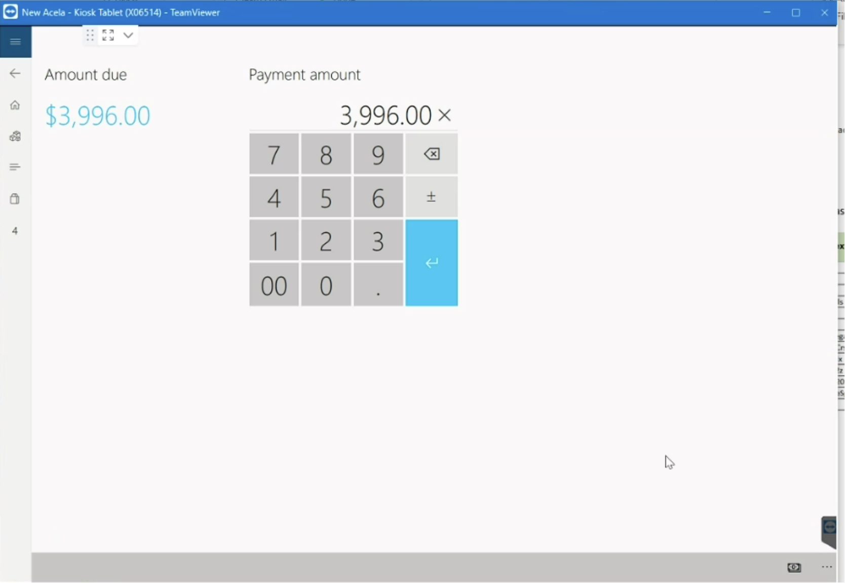
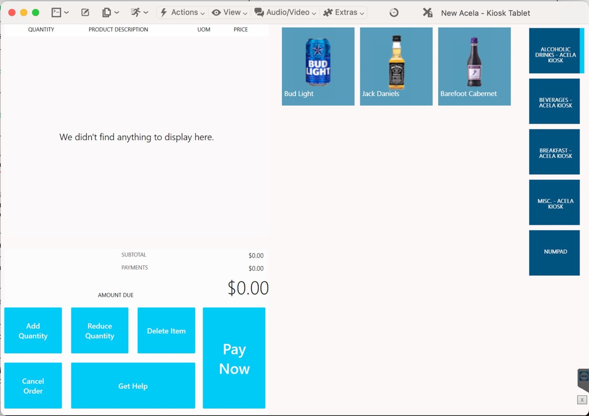
I reviewed the developers' initial work and analyzed the screens to check for alignment with the Amtrak design style guide.
Key Findings:
- The colors and fonts did not adhere to our style guide.
- Some color pairings, such as the highlight blue with white text, did not meet ADA guidelines.
- Buttons were square instead of rounded.
- The overall look and feel of the development team's design appeared dated and not user-friendly.
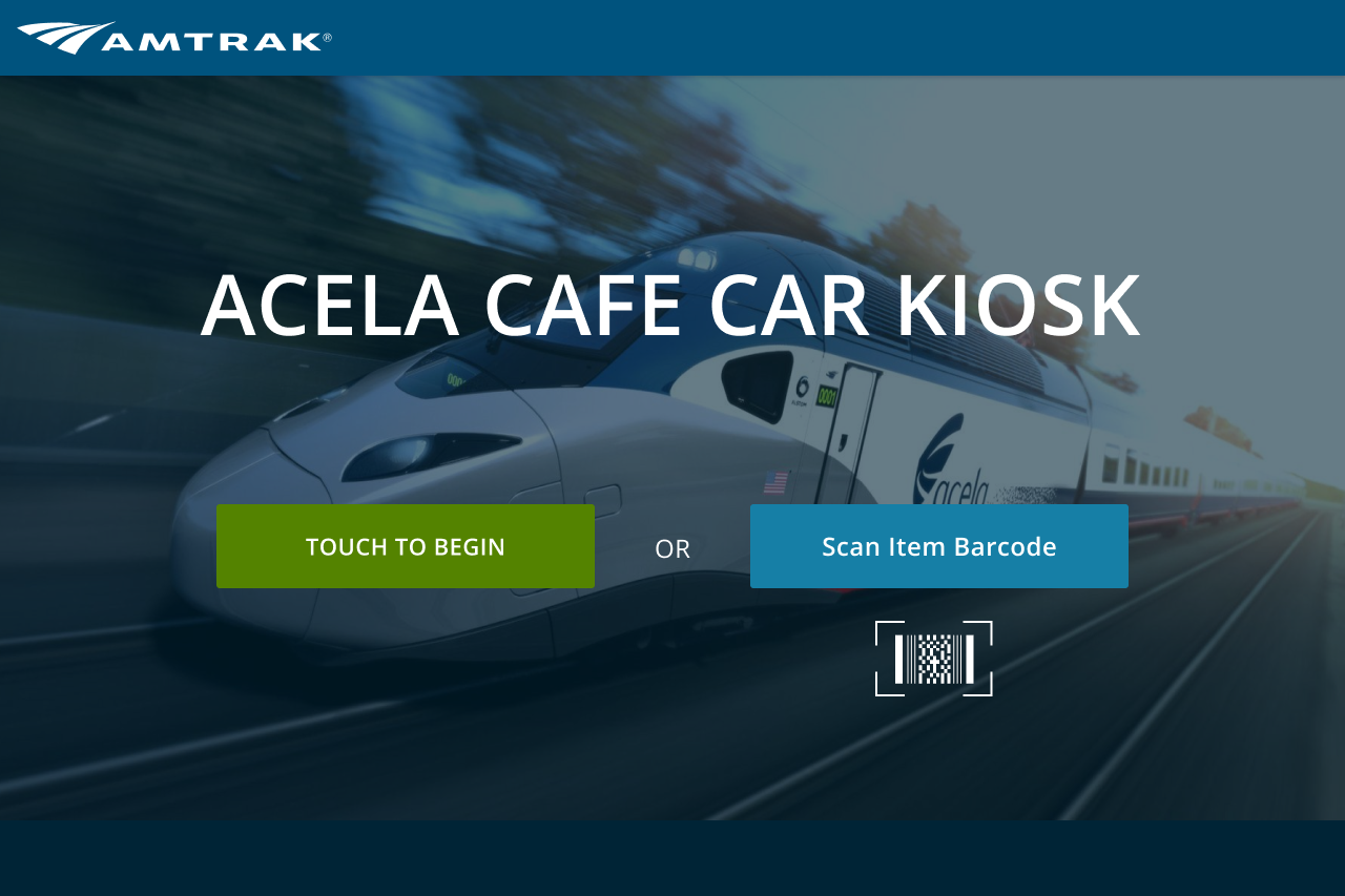
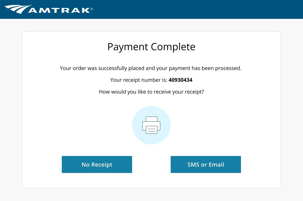
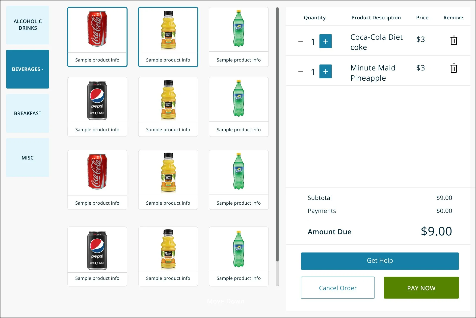
Here are four of the many screens I have worked on for the kiosk. My goal was to modernize the interface and optimize the use of screen space.
I believe the changes I made to the cart screen significantly enhance the user experience. For example, I replaced the 'Remove Quantity' and 'Add Quantity' buttons with a counter to adjust item quantities. This reduces the number of buttons at the bottom of the screen and places controls within the cart area, making the interface more intuitive. Additionally, I transformed the 'Delete item' button into a trash can icon, further streamlining the design
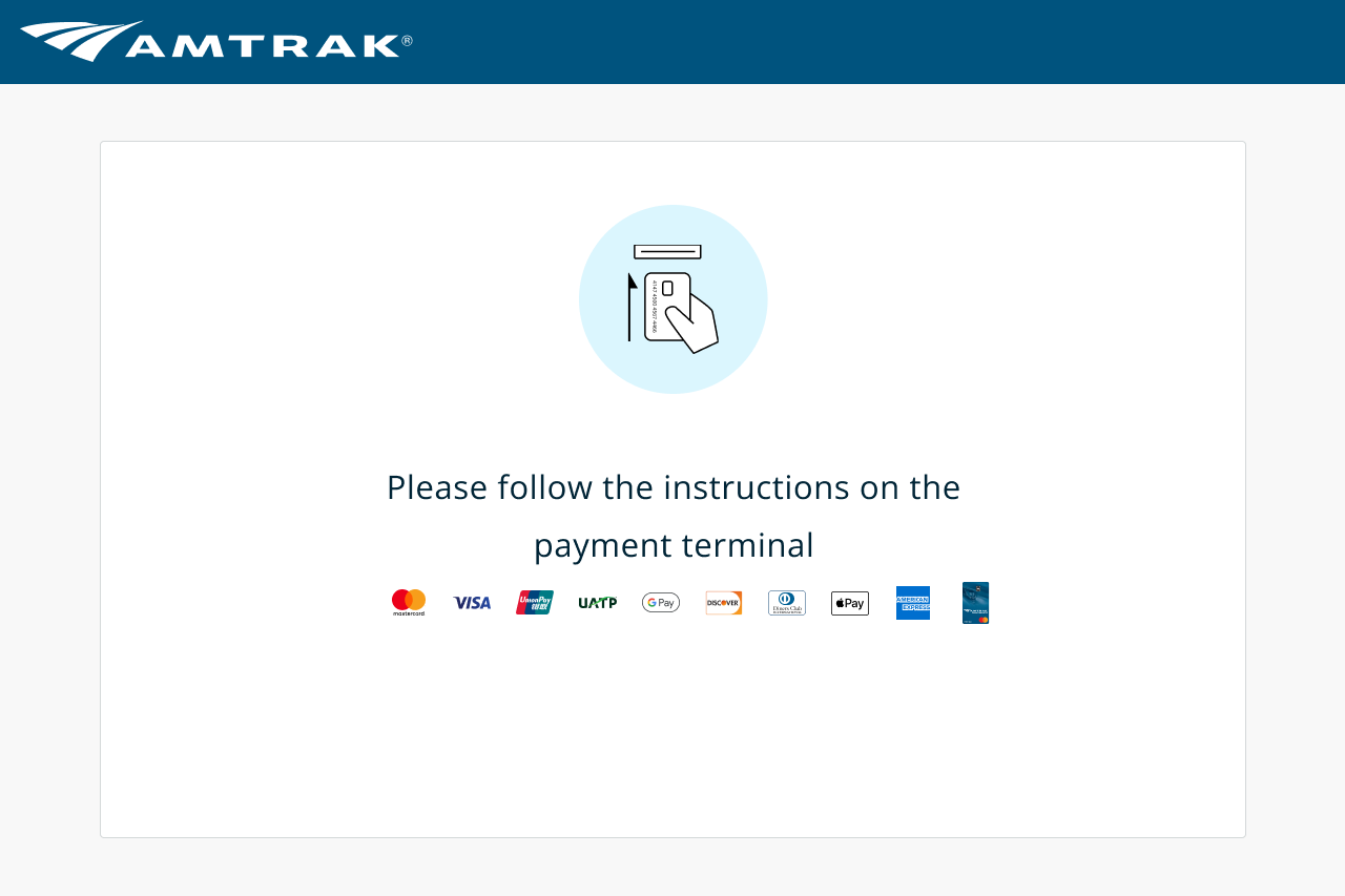
The initial payment screen was overly simplistic, resembling a basic calculator and lacking crucial functionality. To improve the user experience, I added a 'Review and Pay' screen. This screen allows users to verify their selected items before proceeding to payment. The new payment screen now includes clear instructions for using the payment terminal and displays the accepted credit card types, ensuring users are well-informed and confident about their purchase.
Next Steps
Currently, the designs have been handed off to the development team. I am now working closely with both the development and testing teams to ensure the designs are implemented correctly.
User Research
Our team’s UX researcher, Apoorva, and I conducted a usability test on UserZoom with an age demographic of 18-55+, with the majority of the participants being between 25-44 and 55+.
We gave the participants two tasks to complete.
1) Add or remove item quantities in the cart
2) Remove an item from the cart
Summery of keyfindings:
Most users were able to understand how the prototype works and successfully completed the tasks. However, we got a lot of comments about the ease of using the prototype, and some about the layouts of the screens and the buttons. Specifically, users had issues with the ‘Add Quantity’ and ‘Reduce Quantity’ buttons, and the ‘Reason for Void’ question while deleting an item.
HI-FIDELITY WIREFRAMES
Cafe Car Kiosk
Duration
9 months - Complete
Team
Bite on Board Team
Tools
Figma, Userzoom, Microsoft Dynamics 365 Commerce
Role
Product Designer
Overview
I was given the task of designing the point of sale (POS) system for the cafe car on the new Acela trains.
The goals and deliverables of the project were to create a system that displays Amtrak’s food and beverage offerings, allowing customers to order, pay for, and pick up their selections efficiently.


